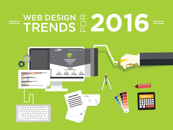
Things you need in your website in 2016
#1 Your website needs to be easy to navigate
Viewers should be able to find what they are looking for. If you have a small 5-10 - page website it is not hard to accomplish this but as your website grows it is more difficult to make the navigation intuitive. You should be aware of the top things visitors of your website want to find out and you need to make these things very easy to locate. Different techniques can be employed but they will depend on the details of our business and the website. Here are some techniques we use depending on the client:
- Search box function – this technology will search your entire site for the string that was entered by the user and then makes a list of the pages where the information could be found
- Main navigation listing more than one or two words. Even images can be embedded in the navigation
- Main navigation has pop-ups if the mouse has hovered over one tab. The pop-up could be a whole list of related links
- You can use multiple navigation menus so that the most common items are listed on tabs across the top while special things to your industry could be in a vertical list of options that stay even when different pages are visited.
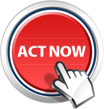
#2 Your website should have calls to action
A call to action is what you would like a new visitor to on finding your website. It could be as simple as presenting your phone number in a prominent place but could be much more. Unless the only purpose of your website is to act as a brochure you send people to, you will have something in mind that you would like new visitors to do when they view your website or any page of it. Here are some sample calls to action that apply to different businesses:
- A phone number with the words call now
- A form to have the business to call or email the viewer
- A form to schedule an appointment
- A link to sign up for a newsletter or white paper
- A link asking the viewer to submit their questions
- A link to see the special of the day or week (an enticing offer)
- A quote in 30 seconds click here


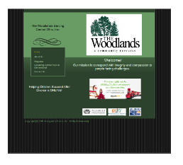
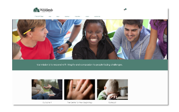
#3 You need good images that support your value proposition
Images attract the eye and set the tone of the website even before one word is read. Eye tracking studies have proved this. The image above the fold off the left of the site is the first thing people view.
#4 Responsive Web Design
Now more than ever your site needs to be attractive and viewable on screens ranging from a cell phone’s narrow view, to a tablet to a desktop. Depending on your industry, up to or more than half your visitors could be viewing your site on a cell phone. Not all responsive designs give the most important information first. The site could be of approved responsive design which means that all the text is readable and the navigation buttons are big enough and far enough apart from each other for fat fingers. This still doesn’t mean that the first view of the site is what will do you the most good. If you own a restaurant for example, you do not want the entire screen taken up with an image of food. Your mobile visitors will most frequently want to call you or see where you are located.
#5 Contemporary Design
I am listing this fifth because the other things seem a bit more ‘important’ but you cannot discount the overall look of the site. Today websites (especially when viewed on a desktop) expand in width to the size of your viewing window. Most sites are characterized by wide open spaces; crisp images and thoughtfully placed calls to action. If you do not look at least as good as the sites in your market you stand to lose business. Many sites have a ‘slider’ image at the top where multiple images, all relevant to some portion of the business, are swapped one after the other. The images will frequently have some message overlaid or a call to action button and link.
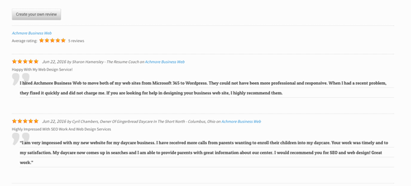
# 6 You need testimonials
We call this social proof but it has proven to increase the number of people contacting you. Sometimes you can add pages on your website called testimonials or you can place a testimonial on every page right after the main message of that page. Some websites have testimonial slider which rotates several messages all in the same spot on your website. This is a powerful tool to increase website conversion and if your competition is doing it you certainly need to.
#7 Industry Badges or Certifications
This is to give you the authority and relieve someone’s built in aversion of calling someone they do not know. If you have a giant BBB A+ logo on your site or a “Wedding Wire Couples Choice Award 2016” it goes a long way to helping the viewer contact you.