What is a CTA in Web Design?
By Daclaud Lee, Project Manager / SEO Consultant at Archmore Business Web
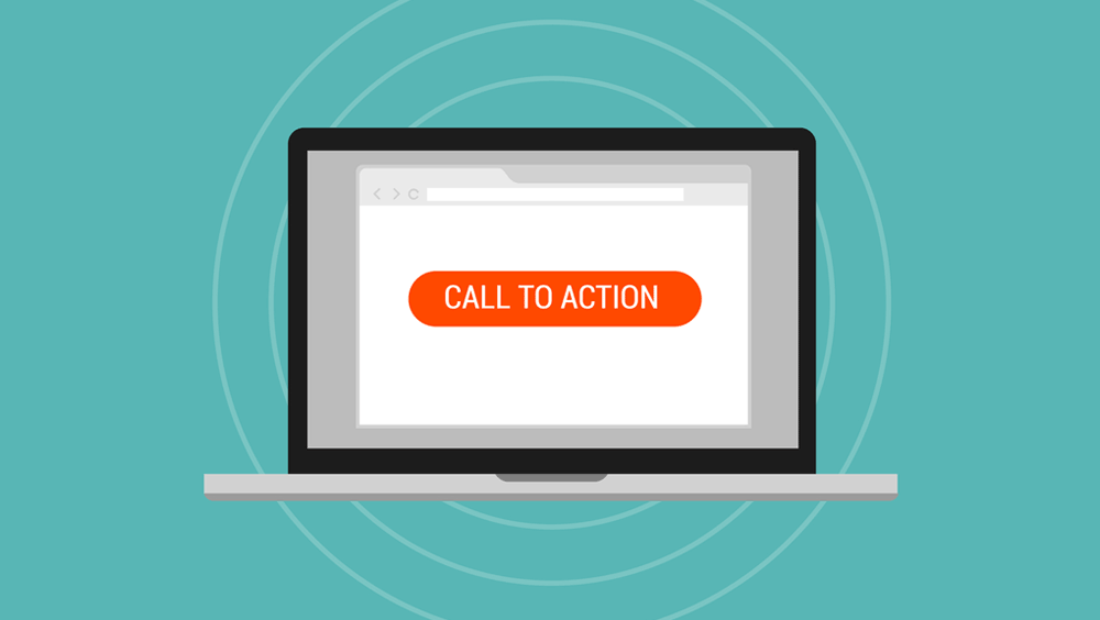
Call to Actions (CTAs)are used to grab the attention of the user or to encourage users to make a decision. An effective call to action is concise, clear, and compels the user to take immediate action. A call to action is a prompt on a website that tells the visitor what they should do next. It can be something simple like 'click here to learn more' or even just a button with the word 'buy' on it. Unfortunately for some people, it's easy to get lost in directions on a website and become confused about where to go next, so CTAs are very important for guiding customers through the process of purchasing a product from your website.
A call to action is one of the most important parts in any page because it shows the flow path for the user, which suggests where and how will they continue navigating through your site. The goal is to typically aim at increasing conversions through continuing visitor engagement, whether that be requesting more information, submitting their email address, or completing a sale.
CTA Examples and What They are Used For
A CTAs (or CTA) is a piece of content intended to prompt an immediate response or encourage an immediate sale. A CTA will create a sense of urgency to get the reader to act before they lose the chance. Here are some successful examples of businesses using CTAs:
Contact Form
A contact form is a web feature that allows visitors to send a message to the website owner. Because contact forms are possible through website builder tools, anyone can set up an effective way to collect visitor information and connect with new customers.
Contact forms are an essential element of any website. Your users may want to reach out to you for a variety of reasons like inquiring about your product, asking for help with a problem, or giving feedback on your content.
Add to Shopping Cart Button
The primary purpose of an "Add to Cart" button is to invite customers to add the product to their shopping cart. When a customer is ready to buy an item, they often click on the Add to Cart button without thinking. It's a very instinctive action. In terms of improving conversion rates, adding a buy now button is one of the best ways you can improve your sales and increase revenue on your website.
Add to shopping carts are used to encourage customers to purchase items online by adding an item they are interested in to their shopping cart and then proceeding to checkout.
Buy Button
Buy buttons are used in web design to create a direct call to action that leads the user to an easy way of completing a transaction. A buy button should be short, sweet, and to the point. The user's attention span is very short online and our buy buttons are designed to give them what they want as fast as possible.
Social Media Share Buttons
Social media share buttons are hyperlinks to different social media sites that allow users to share content from your site. They make it easy for people to recommend your content on Facebook, Twitter, and other sites. They are very popular on websites that specialize in shareable content (such as blogs, entertainment, informational or news sites) and typically appear near the top and bottom of articles and blog posts.
Social media buttons are designed to make sharing content online as easy and convenient as possible. They encourage social engagement by allowing your audience to share content they like with their friends and followers.
Email Subscription
An email subscription CTA is used to gather potential leads from website visitors. It is a fast and effective way to capture leads, which can later be nurtured through an effective email marketing campaign. The goal is ultimately to lead users toward a conversion. CTAs not only guide your prospects toward a specific action you desire, but they can also help display the value of your offerings and influence their decision-making process.
A subscription form is also the perfect way to allow your audience to express interest in your content, products or services. An email subscription CTA is a form on your content page requesting readers to provide their email addresses. This will allow you to create a list of people interested in receiving updates from your company and who may be more likely to purchase from you in the future.
Book Now Button
The book now Call-To-Action (CTA) is a button used to encourage a viewer to take immediate action, either on the internet or in person. The book now CTA can be customized and used for any situation where you want the customer to make an immediate decision, such as booking an appointment—whether that’s online or over the phone.
The book now CTA is used to navigate customers who are ready to make a booking after comparison shopping for their best option. The Book Now CTA is meant to be a clear call-to-action button used to entice a user to begin the booking process whether it be for an appointment, a hotel room, or to set a date for service. The CTA should be clearly visible on all pages for maximum conversion, and is a great opportunity for personalization to guide the user through the purchase funnel.
Learn More Button
The Learn More CTA is used to indicate that the user can click a link or a button to learn more details about a specific topic. It helps drive users further into your website by showing them areas they can expand on, where they might be interested in learning more details. This can be on their own terms, so they can decide if they want to know more without being bombarded by all the information at once.
When you want people to know more about your company or product, but their first impression of it is online, you can't trust them to take the initiative to seek out further information. That's where a Learn More CTA comes in. It gives visitors a chance to keep learning about your business and decide whether they want to continue the journey.
Download Button
The download button CTA is used to prompt users to download or purchase a specific app from their web browser. Their web design style is commonly seen in websites that are associated with mobile apps, for instance those that are created to advertise and offer the app for download or purchase.
If you’re trying to attract downloads of an app, e-book, informational package, menu, or website design template, then you should have a captivating download button that is enticing and visible. The download button tells the user that they can access the content right away and still benefit from the quality of service.
Free Trial
The purpose of a free trial CTA is to bring new users in. In a fully-functional product, this means giving the user a chance to interact with the product without limitation, then giving the user a limited-time opportunity to pay for continued use. Free trials are also an effective CTA because they lower the barrier of entry and make taking action easier for the user.
This free trial CTA allows the user to download or demo an app, software, digital product. It creates a sense of urgency and removes the barrier of price from the equation. Most customers might not be aware of how much a product or service is worth but they understand that free trials are limited. If the free trial CTA appears prominently on a page, then it will attract your visitor’s attention in no time.
Donate Button
The donate now CTA is meant to persuade users to donate money to your non-profit organization. The placement of the CTA above the fold and within the context of an article that discusses the importance of helping others, allows for a better chance of persuading the user to donate.
A donate now CTA makes it easy for a user to make contributions when they find a cause they believe in. This makes makes donating to your favorite organization simple. The donate now CTA should be strategically placed so that the user can donate as quickly and easily as possible.
Let's Get Started
A "let's get started" call-to-action button is used in a web design when the caller wants to sign up for a service, such as getting a free quote or requesting more information. This can help get visitors in touch with your sales team or customer support team. This type of CTA is used to create eagerness and excitement for the benefit of your product or service. A well-placed “let’s get started” may help the reader move from consideration to action by prompting them to take their first step towards getting started with your product or service.
Register Now
A register now CTA can help your business grow its customer base by directing web visitor traffic to a sign-up page. It is designed to help increase the number of registrants. It does this by offering a prominent spot for people to click. It should be used in web page designs for conferences, e-courses, or other events that require registration.
The Register Now call-to-action button is often used in websites where potential users can become members of the site or buy a product or some other type of instant conversion for which registration needs to take place. The user clicks on the register now button, fills out a form and as soon as this process is complete, he can start using the website or product.
Coupon or Discounts
Discounts can help inspire confidence in your customers by making purchasing easier. A get a discount CTA used in a web design can help to encourage customers to make a purchase. It is designed to persuade users to buy a product or service at a discounted price. When done properly, a get a discount CTA can increase conversions and can lead to higher sales.
Promotional discounts are an extrememly useful way of attracting more customers. Setting up a get a discount CTA on your website helps provide information about your offer and persuade customers to engage with your business.
Join Now
A join now CTA is usually used in a landing page where you want to drive conversions. You will have to make sure that you apply the correct design principles to influence your audience to action. It is used to introduce new users to your website. If a user doesn't have an account already, they can click the button and set up a new account.
How to Design your CTA
Your CTA should be a consistent color and size across your website. The CTA should stand out on the page, but still work with your overall color scheme. If you have a bold and bright color scheme, a darker or contrasting color can make your CTA stand out. If your site is muted or neutral, try using a bold color like red or orange to grab attention and make your offer pop.
Color Your CTA Button Appropriately
CTA buttons should be quick, easy and clear for users to take the next step. This means keeping buttons prominent by placing them above the fold and larger in size than standard text. Common colors such as red, yellow, green, orange and blue are great for CTA buttons whereas white, black, brown and grey often may not work as well.
Effective CTA Color Designs
Here are a few tips for effective CTAs: Use contrasting color combinations that are easy to read. Usually just two words (between 7-12 characters) in your button text will do. Add whitespace around your CTA to make it stand out. Make sure your CTA button is placed above the fold (viewable without scrolling).
- Red evokes passion, excitement, and urgency
- Orange encourages immediate action
- Yellow grabs attention and is optimistic
- Green means “go” and is easy for our brains to process
- Blue creates trust and sense of security
- Purple is calming and soothing
- Pink is romantic and seen as feminine
- Black is sleek and used for luxury
Choosing the Right Color Scheme for Your CTA
CTA buttons are more than just text, they should have a color scheme as well as effects to catch the user's attention. While there is no one size fits all, bright colors seem to be more popular and it is best to use CTA buttons that contrast with the background color and fits the theme of your website's design.
Read More: What do all the colors mean in design?
CTAs are Essential to Your Website
CTAs are essential to a website landing page because they guide and encourage people to take a desired action, such as signing up for an email subscription, or purchasing a product or service. CTAs send visitors to the next step of their journey on your website. Without a clear goal for your visitors and a way for them to get there, visitors become confused and are less likely to stay on the page or return. By providing clear CTAs, you provide a direct line between visitor engagement and conversion.

By Daclaud Lee,
Project Manager and SEO Consultant at Archmore Business Web
Find out how Archmore Business Web can help you get MASSIVE traffic to your website!
Call now: 614-568-7500
Ext 1
Book a call with Mike Forrest, CEO of Archmore Business Web